KAJA by Numa
Brand identity, website and menus for a destination restaurant in Ubud, built as one system from the logomark to the reservation.
Context
A restaurant conceived as a complete evening.
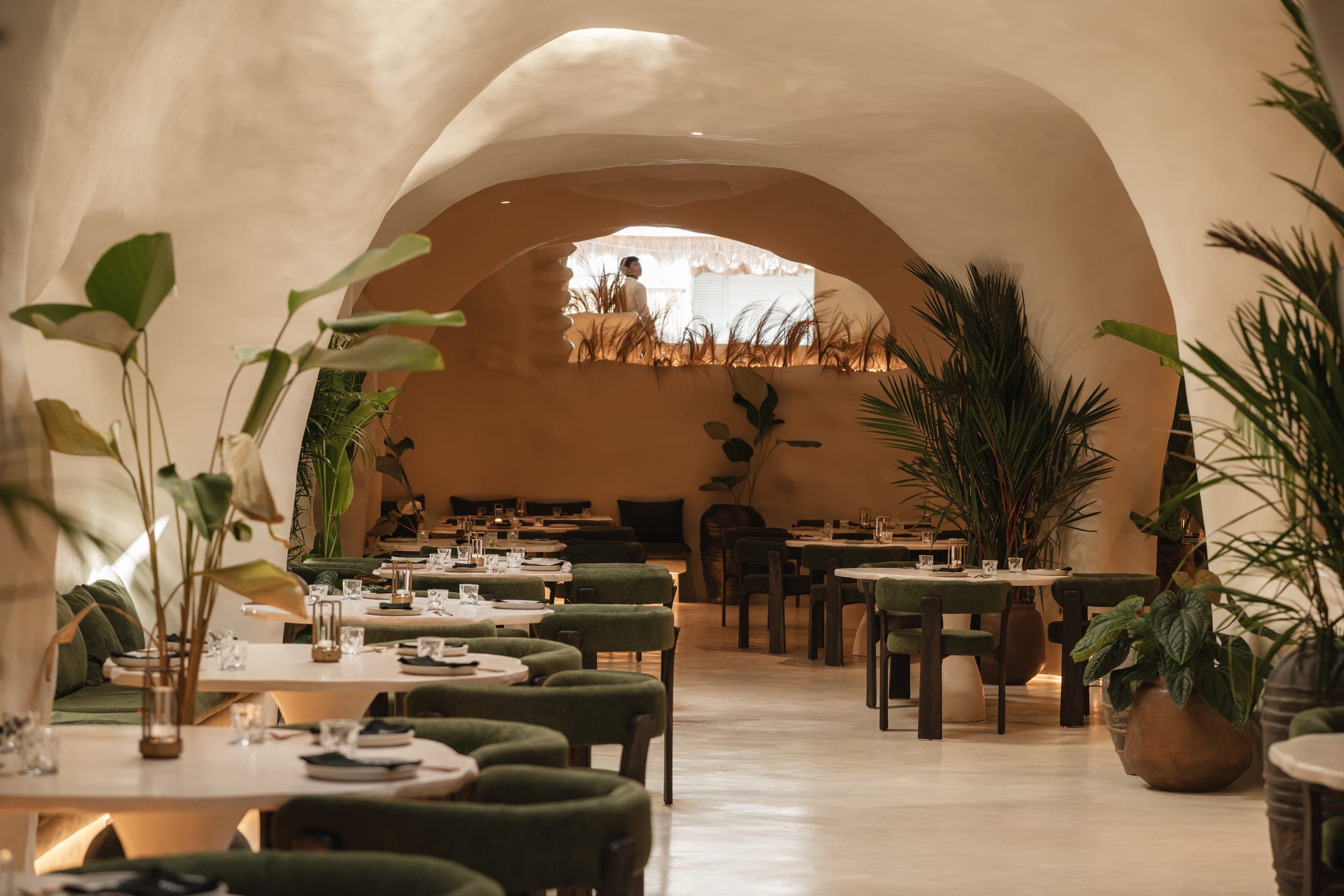
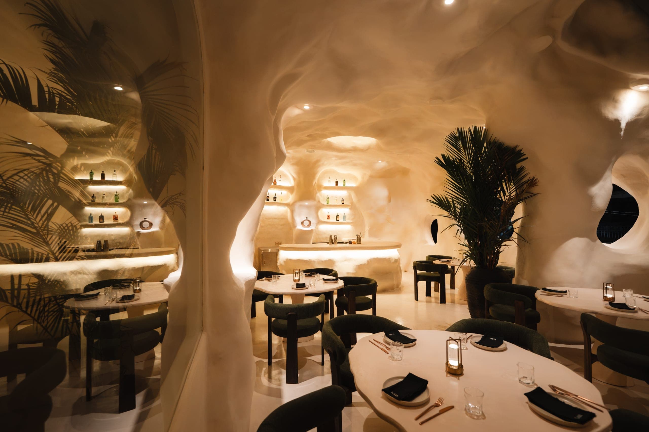
KAJA was created to be more than a restaurant: a destination in Pengosekan, Ubud, where a hand-sculpted room, contemporary Mediterranean cooking and entertainment come together. That ambition needed one identity that holds everywhere a guest meets it, from a story on their phone to the menu on the table, rather than a set of separate design outputs.
- Location
- Pengosekan, Ubud, Bali
- Cuisine
- Contemporary Mediterranean
- Scope
- Identity, guidelines, website, print and story menus
Approach
Three decisions held it together.
- 01
The mark comes from the room
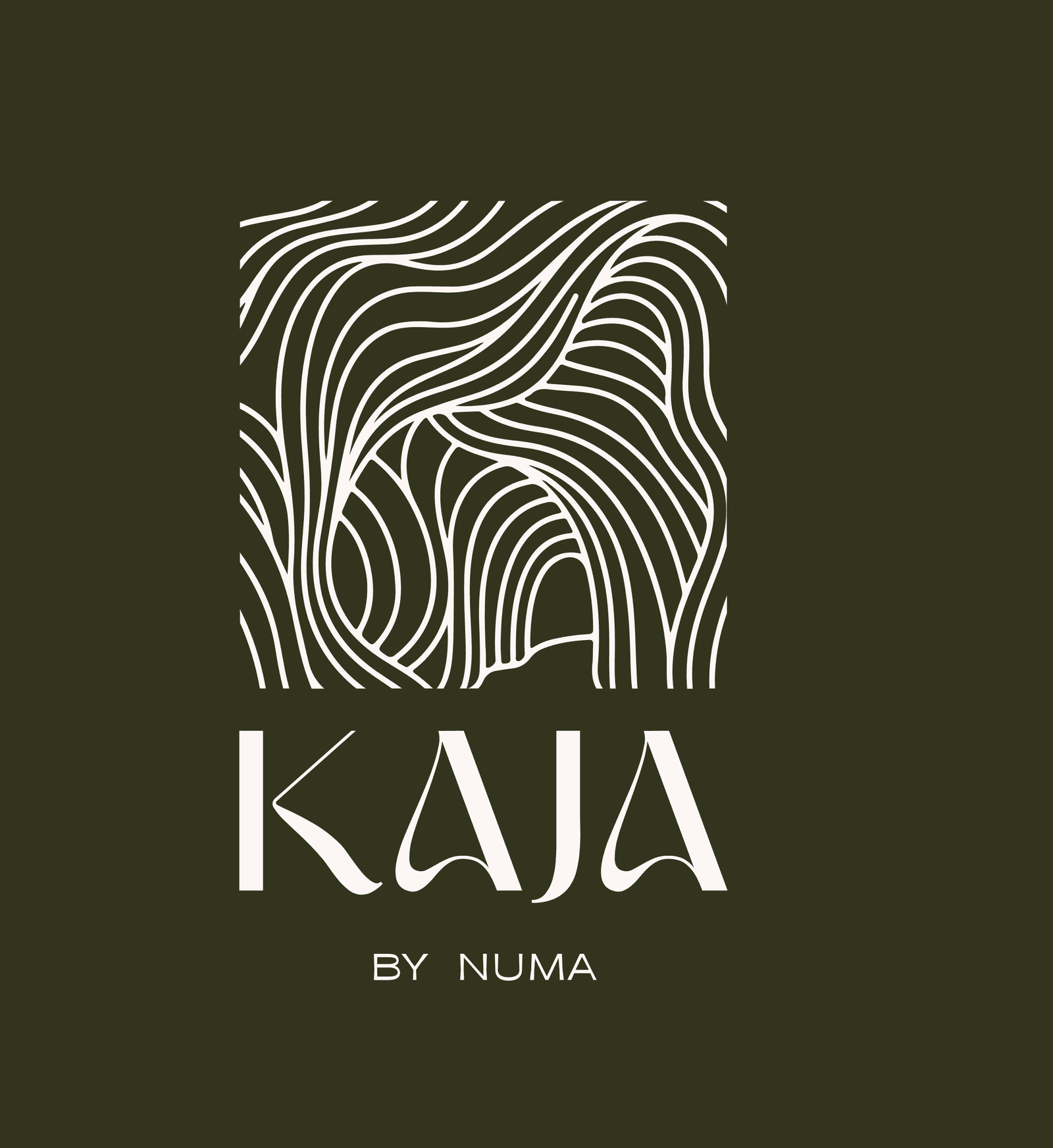
The logomark abstracts KAJA's hand-sculpted interior into flowing lines that also echo Ubud's tree textures, so the identity begins with the space guests walk into.
- 02
One typographic voice
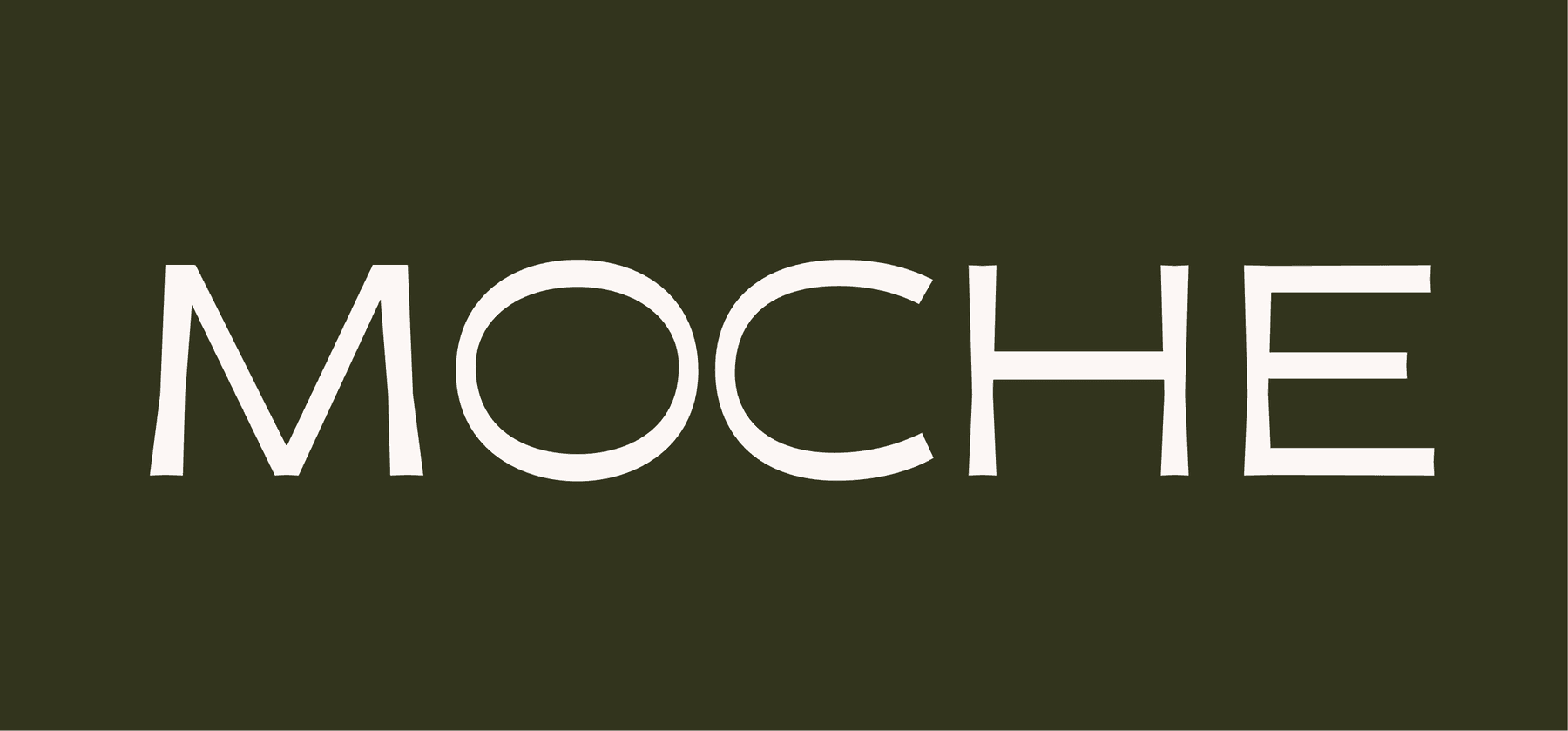
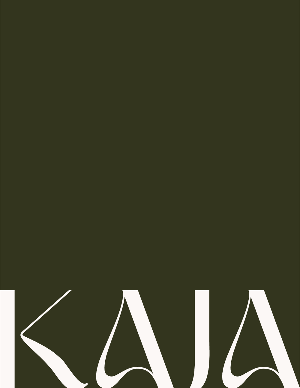
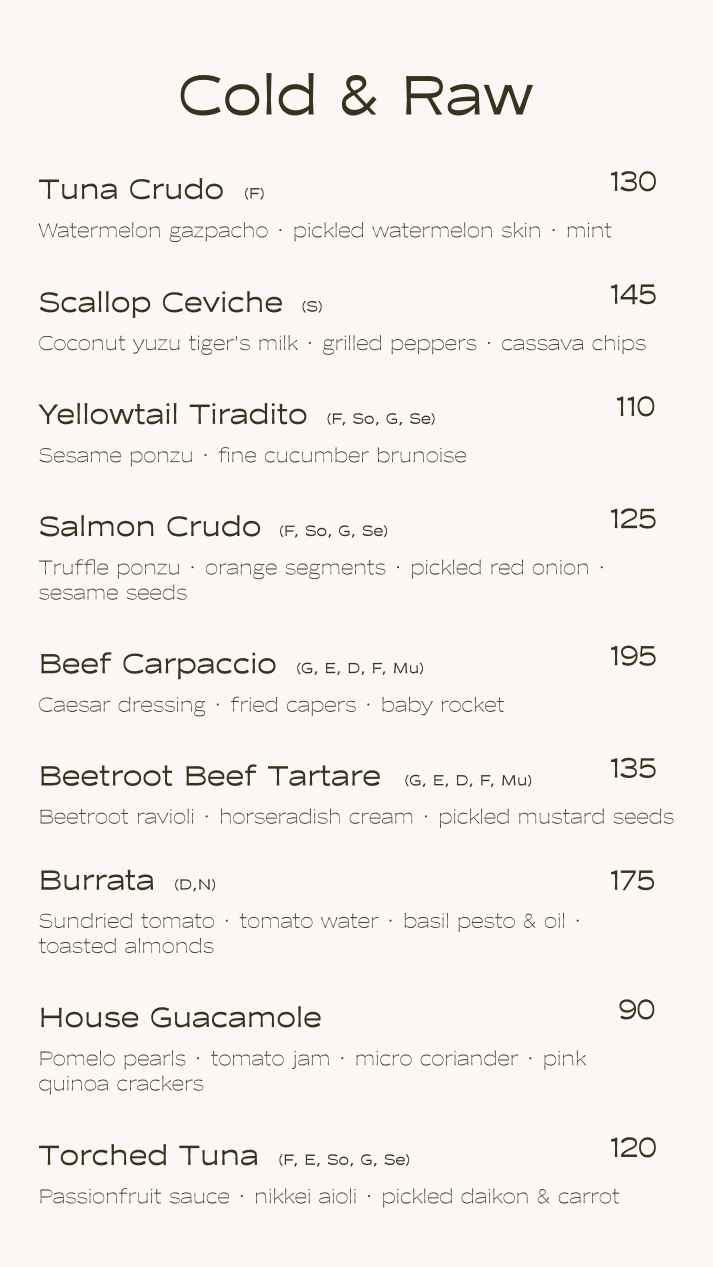
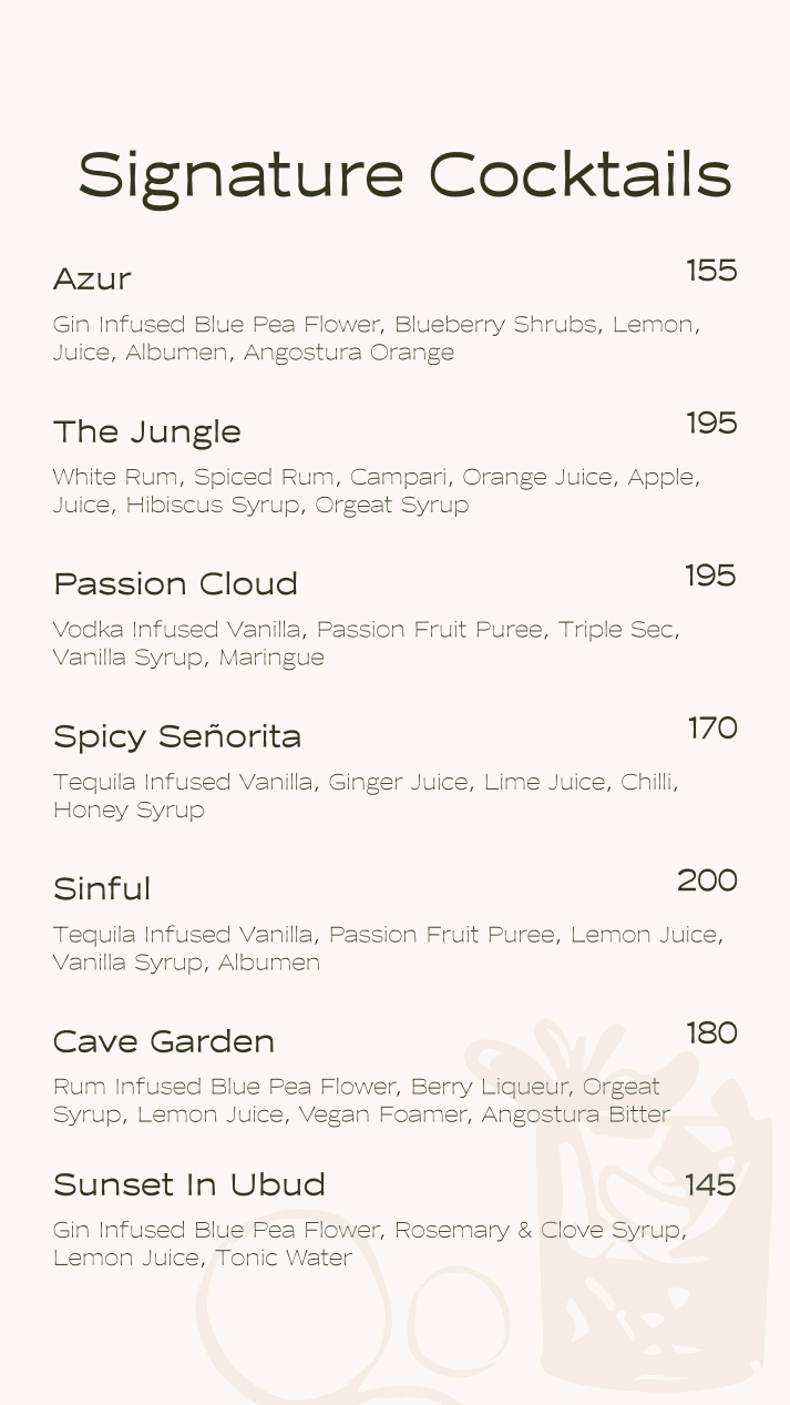
Carmine for the logotype, Moche for everything else. The same pairing runs through the guidelines, the website and every menu.
- 03
Every page leads to a table
Each page closes on one reservation action. It hands guests straight to SevenRooms, with WhatsApp as the direct line.
Brand system
An identity drawn from the room.
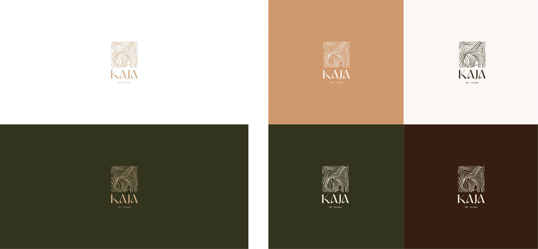
A compact system, documented in full guidelines: logomark, Carmine logotype and lockup, clear-space and sizing rules, a five-colour palette and a Moche type scale.
- #32341D
- #371E12
- #D6B283
- #D0986D
- #FCF7F5

Digital experience
The website, in the same voice.
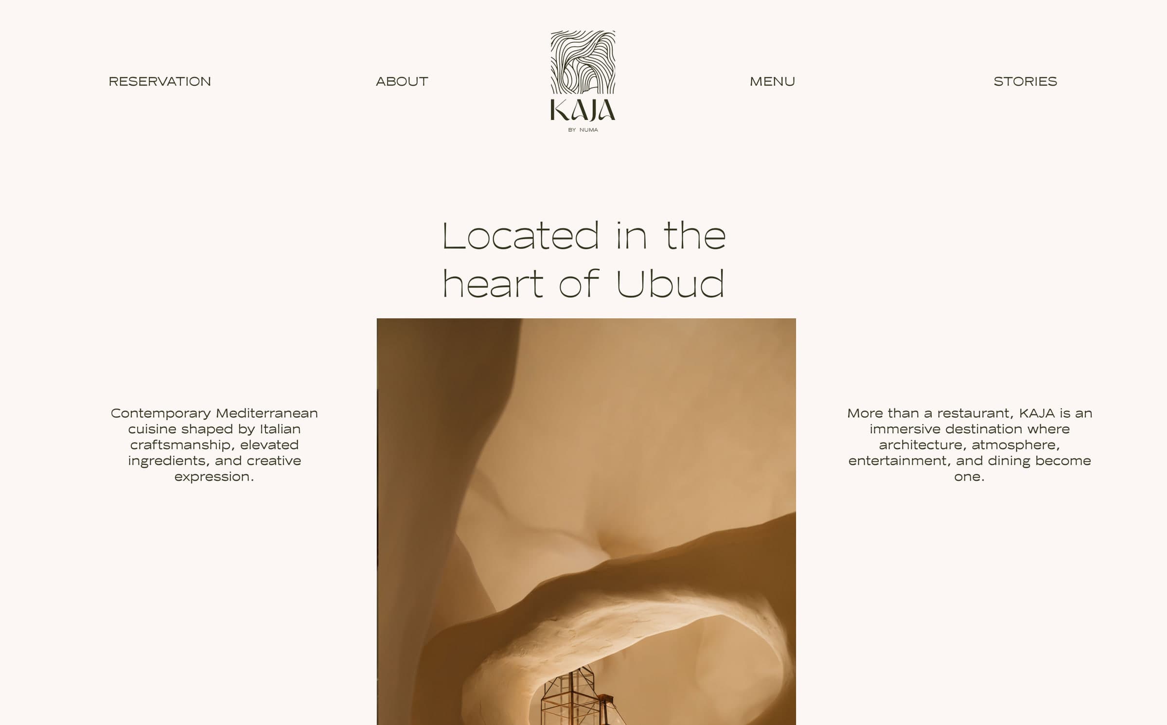
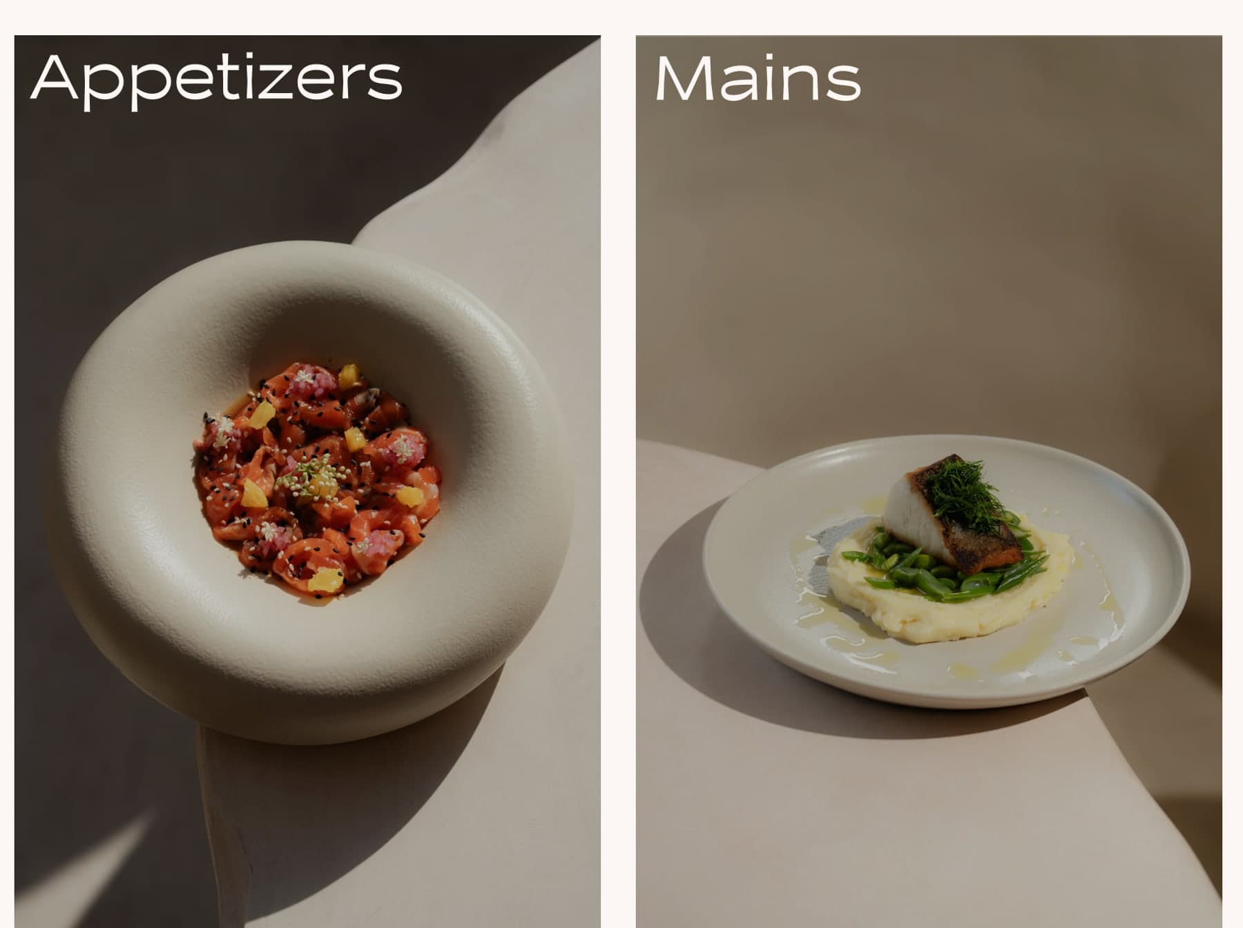
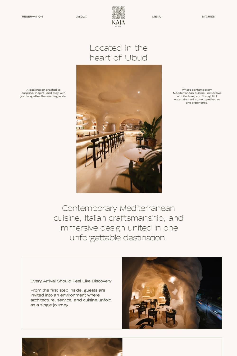
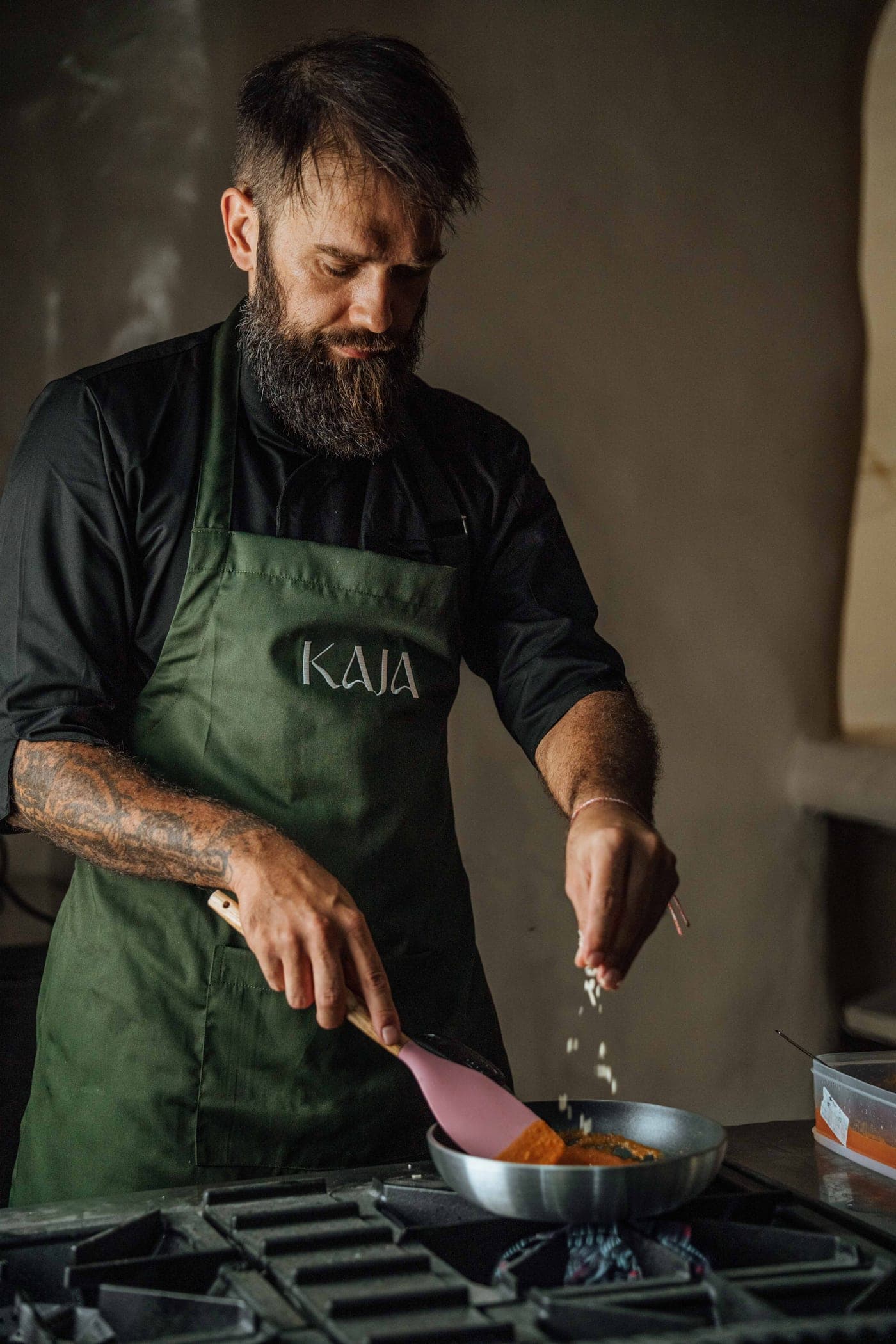
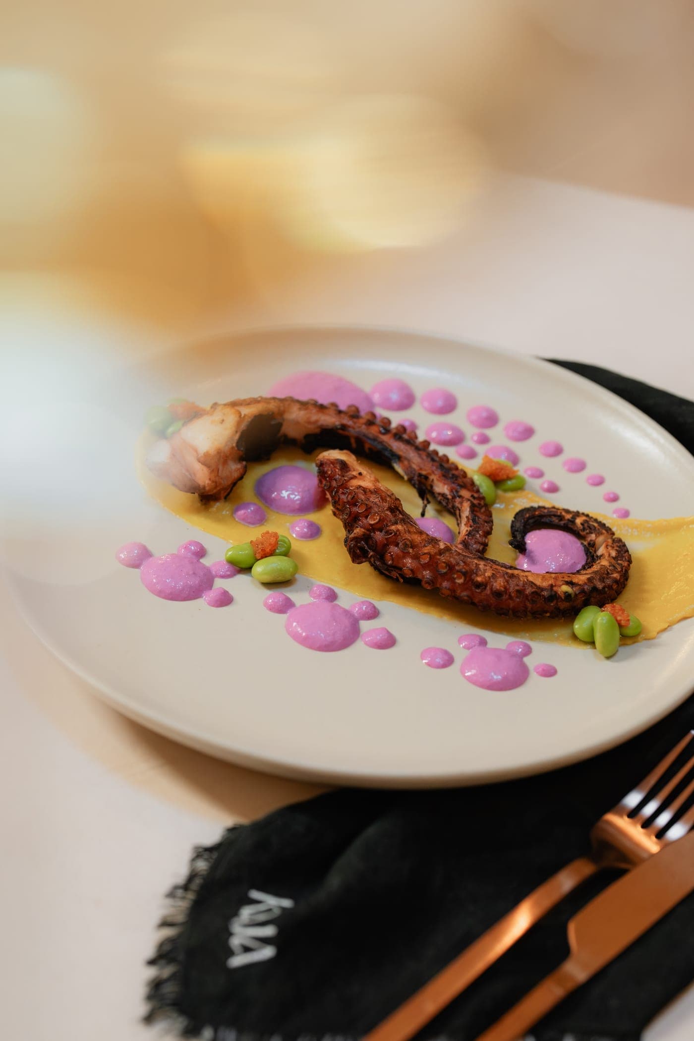
Home, About, Menu and Stories share the print work's cream ground, Moche typography and photography-led layouts. The menu is browsable by course, and every page closes on a single reservation action.
Hospitality touchpoints
From the table to the feed.
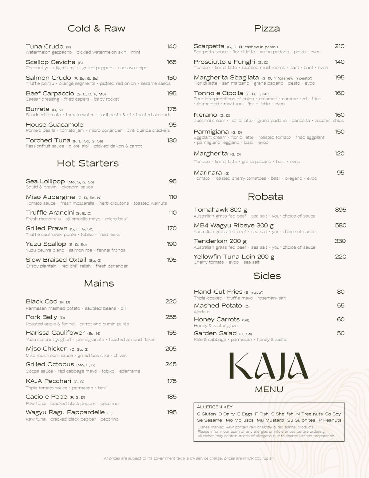
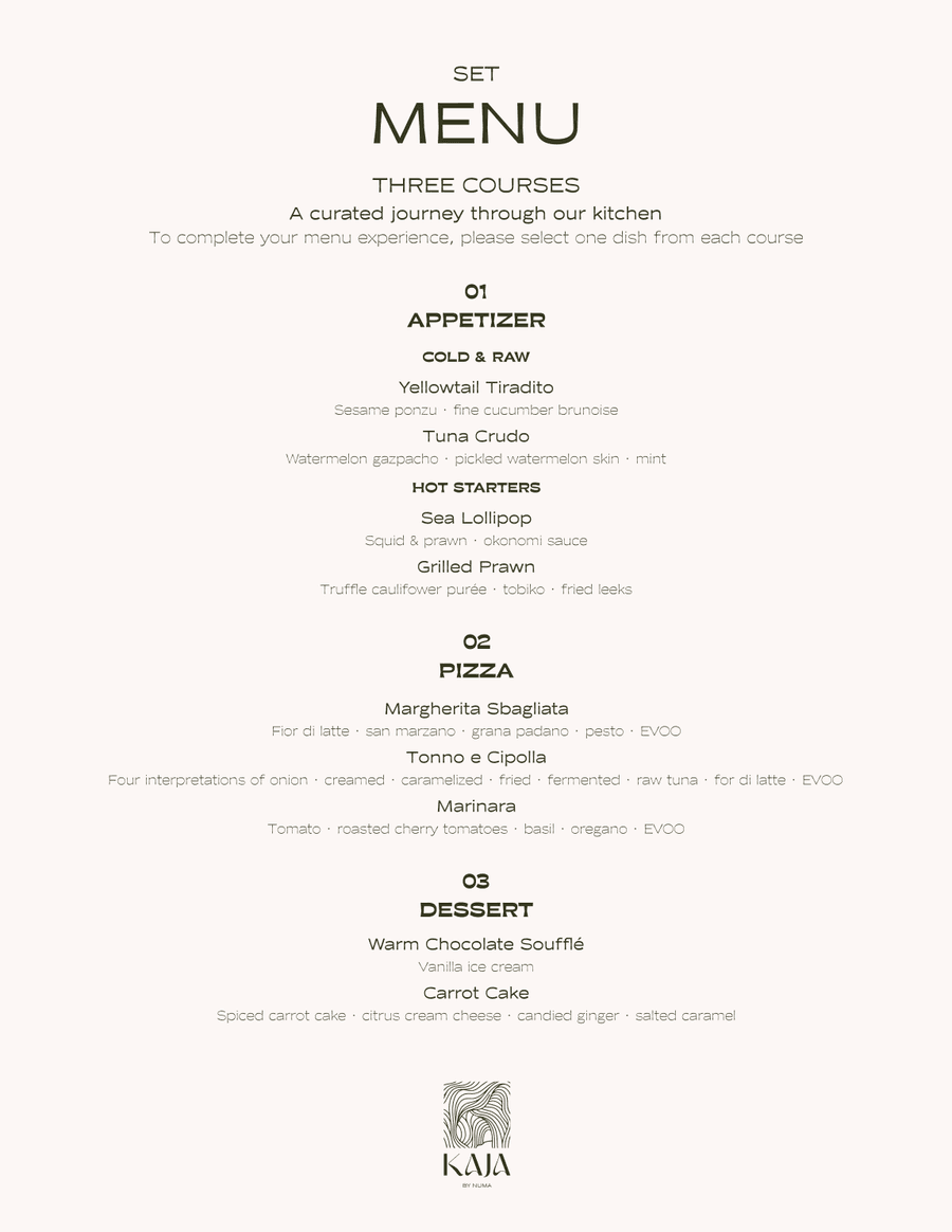
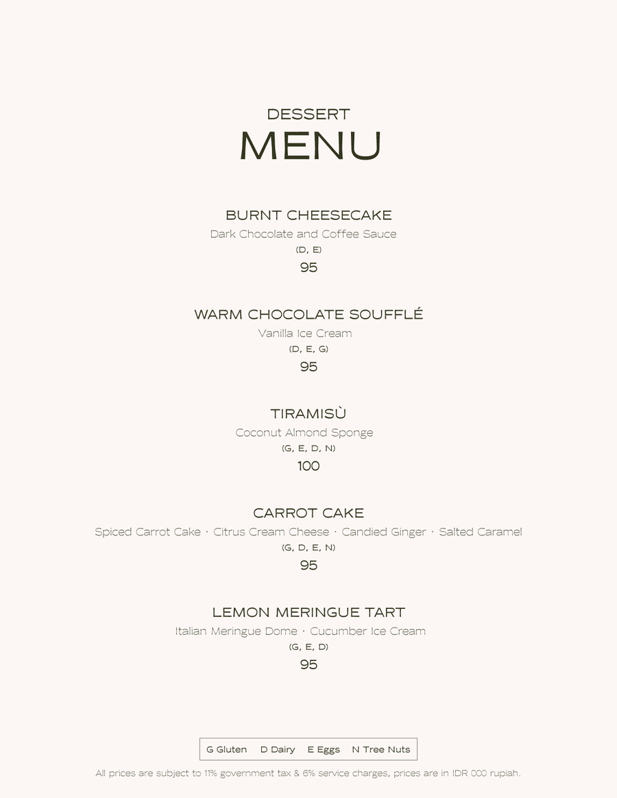
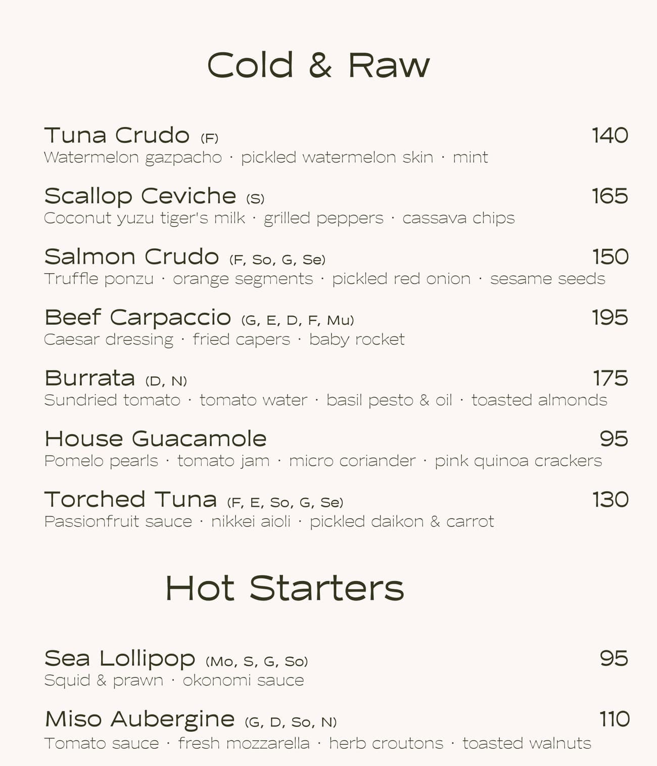
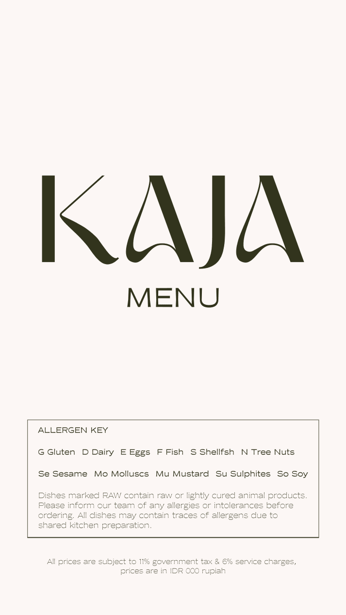
The same typography and palette run through the à la carte, set, dessert and drinks menus, and into story-format menus sized for a phone screen.
Guest journey
One guest journey
- 01DiscoverInstagram, TikTok and story-format menus
- 02ExploreThe website: About, Menu and Stories
- 03ReserveSevenRooms booking, or WhatsApp direct
- 04DineÀ la carte, set and drinks menus at the table
Capabilities used
- Brand identity
- Brand guidelines
- Web design
- Web development
- Menu design
- Digital touchpoints